 Launchpack
OG image examples: six layouts that work, with real ones
An OG image is the picture people see before they decide to click your link. These are the layouts that hold up at thumbnail size, with real ones made for our own apps.
An OG image (Open Graph image) is the picture that appears when your link is shared on X, LinkedIn, Slack, iMessage, WhatsApp or Facebook. You set it with one tag in your page's <head>: <meta property="og:image" content="https://…/og.png">.
The layouts that work best show the product name, one short line and either a screenshot or a strong color, at 1200 × 630 pixels, with text big enough to read when the image is shown at a quarter of its size.
What an OG image is
Open Graph is a set of <meta> tags, started by Facebook and now read by almost every app that shows link previews. og:image is the one that holds the picture. When someone pastes your URL, the app fetches your page, reads that tag and shows the image above or beside your title.
<meta property="og:title" content="Launchpack">
<meta property="og:description" content="Every launch image in 30 seconds.">
<meta property="og:image" content="https://launchpack.pics/og.jpg">
<meta name="twitter:card" content="summary_large_image">
Without it, most apps show a bare link or a random image from the page. The size to use is covered in the OG image size guide (1200 × 630), and the troubleshooting guide covers previews that don't appear.
Real examples
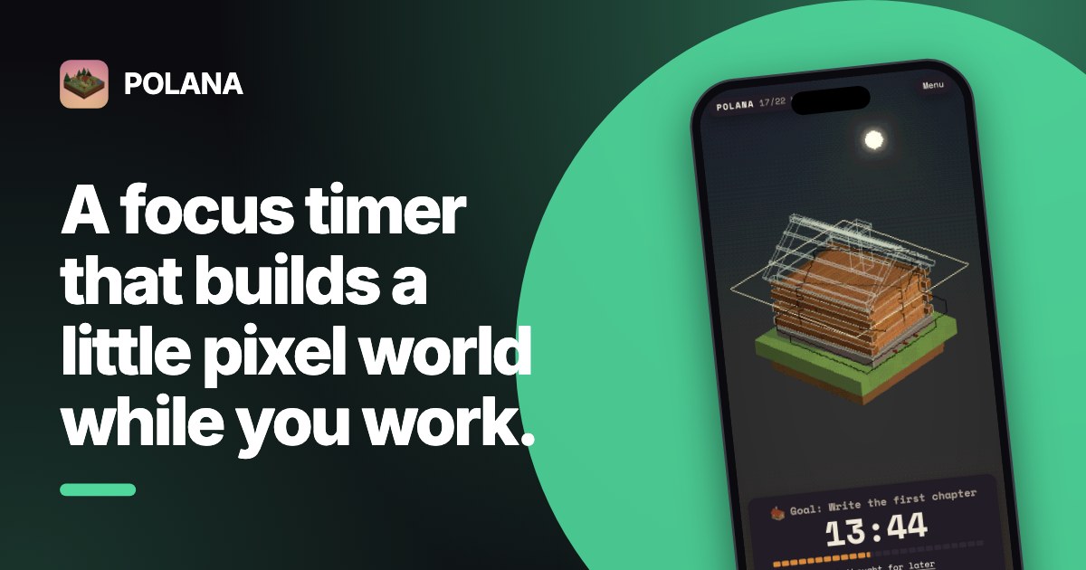
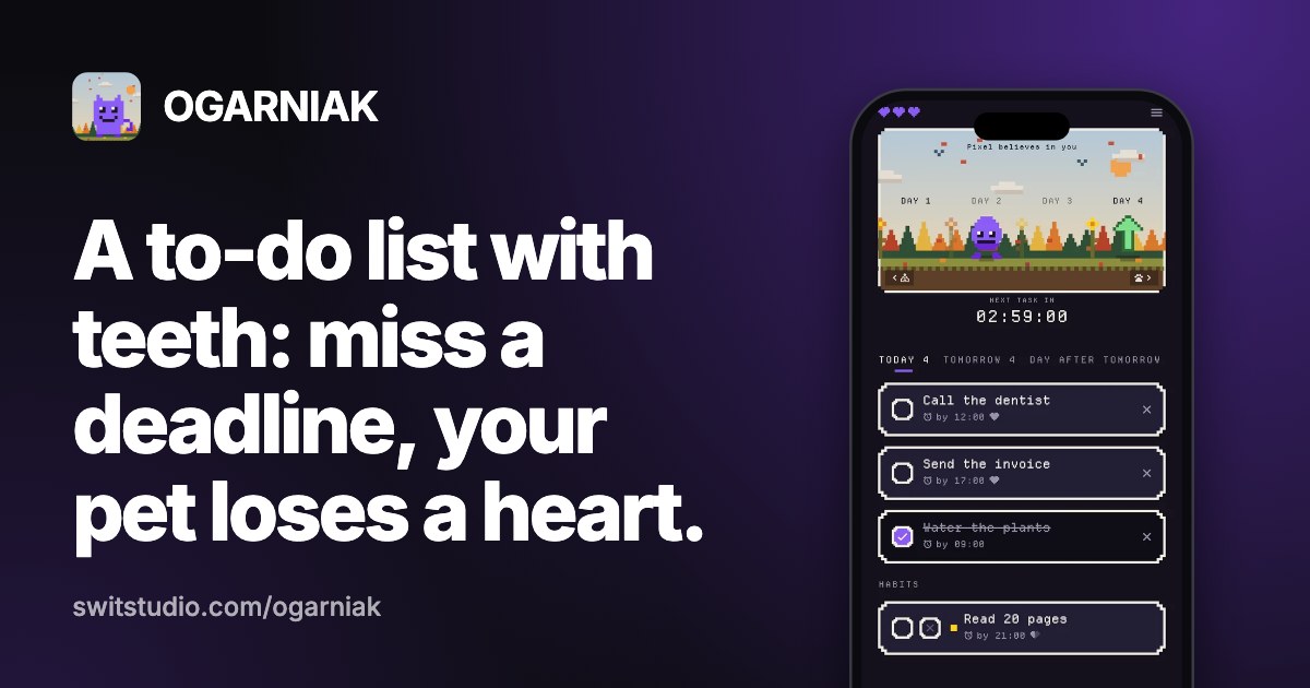
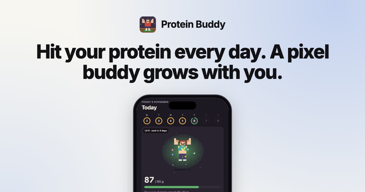
These three were made for our own apps with Launchpack. All are 1200 × 630 JPGs under 100 KB.
Six layouts that work
| Layout | Best for | What's on it |
|---|---|---|
| Text left, screenshot right | SaaS and web apps | Name, one-line benefit, a browser-framed screenshot cut off at the edge. |
| Centered title | Home pages, landing pages | Logo, name and tagline in the middle on a brand color. No screenshot. |
| Big bold statement | Launch posts, announcements | Four to six words in very large type: "Launchpack is live." |
| Phone mockup | Mobile apps | A phone frame with the app's best screen, plus name and tagline. |
| Blog title card | Articles and guides | The article title, site name and author or date. Same template for every post. |
| Minimal logo | Docs, legal pages, fallback | Logo and name on a plain background. Better than no image. |
What makes an OG image readable
- Large text. Previews are often shown 300–500 px wide, so a 1200 px image shrinks to a quarter. Keep headlines at 60 px or more on the 1200 × 630 canvas.
- Few words. The title and description already appear under the image. Don't repeat the whole description on it.
- One focal point. A screenshot or a statement, not both fighting for space.
- Keep the edges clear. X shows link cards at 2:1 and trims the top and bottom slightly; keep text 30 px from the top and bottom.
- The same look across your launch. Use the colors and screenshot from your OG image on your X header, Product Hunt gallery and favicon too.
What to avoid
- Tiny screenshots of a full dashboard; nobody can read them in a feed.
- White or very light images with no border; they disappear into a white timeline.
- SVG files and images over 1 MB; many apps won't show them.
- A different image on every share of the same page; platforms cache the first one they see.
Make one in 30 seconds
Launchpack has these layouts (Classic, Centered, Bold and Minimal, with a browser or phone frame) and makes your OG image free. The launch kit adds favicons, X and LinkedIn banners and Product Hunt images in the same style.
Questions
What is an OG image?
It's the image shown when a link to your page is shared on social media or in chat apps. It's set with the og:image meta tag in the page's head, which comes from the Open Graph protocol.
What does a good OG image look like?
1200 × 630 pixels, with the product name, one short line and a screenshot or brand color, and text large enough to read at a quarter of the size.
Do I need a different OG image for every page?
Not necessarily. One good image for the home page is the minimum. Blog posts and product pages benefit from their own, usually made from a template.
Can I use a template for OG images?
Yes, and for a site with many pages you should: one layout with the title swapped per page keeps every preview consistent.
What should not be on an OG image?
Long text, small screenshots, important content near the edges, and anything that depends on transparency. Keep it a JPG or PNG under 1 MB.